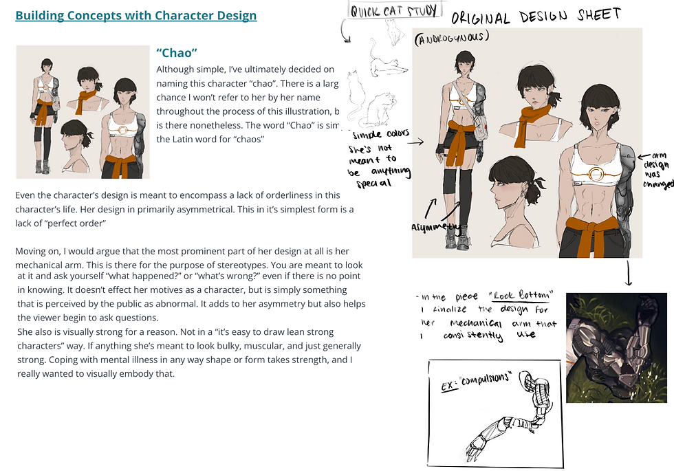
Going Baroque [WIP]
- Maya Ferrante
- Sep 14, 2022
- 1 min read

CHARACTER DESIGN


Before I started the concept of my Baroque-inspired illustration I needed to design characters to use. My main goal was to make them look as if they belonged to the same world, or in the same era, yet have a sort of distinct opposition to one another. Ideally, looking at them and thinking they are just like like opposites.
CONCEPT
The concept I wanted to work with in regard to this piece is the red string of fate. For those who don't know what this is, it's an East Asian legend that states the gods tie an invisible red string around the ankles of those that are destined to meet one another in a certain situation or help each other in a certain way. What I wanted to tell with this piece is a story of two people who have a spark, who are in some way attracted to one another, yet fate is pulling them away from one another.


Basic sketch; Poses
........................................................................
Laying out values, separating the red of the strings, and trying to figure out where the light will hit if the source is in the middle.
........................................................................
Adding in the character's details. They're already designed so this process doesn't take much thought. I used the hair. strings to create an idea of movement.
........................................................................
Blocking in where the color would be
........................................................................
black and white render. One of my favorite ways to digitally paint is coloring all the shadows and value in black and white, then going over with an 'Overlay' layer.


Comments